Logo development
- Helena Evison

- May 7, 2019
- 1 min read


The first logo is the one I blogged previously and is the first logo I created using the brand name Moody. After my presentation touchpoint I decided I wanted my logo to have more of a creative aesthetic that reflects the brands identity more clearly, so I chose to use the Font Pandu to evoke a more hand-crafted, creative aesthetic. I put it behind three background colours, which I got from using Adobe colour wheel with an image Emily has used for design inspiration. I then added my chosen tagline, 'Mindful and Empowering Luxury Women's Wear' to make it clear what the brand is, as a start up I believe it is important to make this clear.

After using this logo for about a week I decided it no longer fitted the image and aesthetic I was aiming for. My brand is current, modern and unconventional and at that point it just looked like a typical sustainable clothing brand, which is not at all my intention. I decided to change the font to Lemon/Milk, which is much bolder, direct and modern and sets the tone for my brand. I then played around with colours which fit the aesthetic.
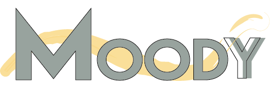
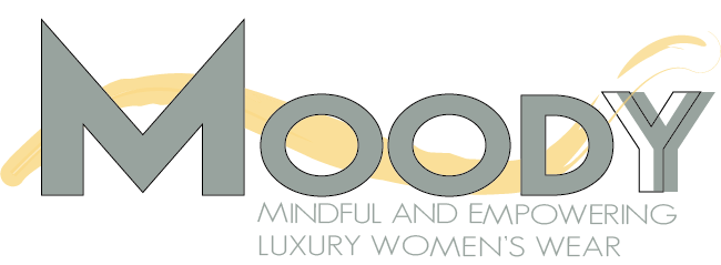
Finally, after much playing around I finally created a logo I was happy with. I like how the yellow paint brush mark behind the bold text contrasts, representing my brands bold nature and creative flair. I have two versions one with the tagline and one without for different purposes, especially as the tag-line becomes un-negligible at a certain size.
Helena


Comments